ShopDreamUp AI ArtDreamUp
Deviation Actions

Printable cat posters
Printable posters with cat inspired with my cat Ferdinand, made in mixed media (ink, oils, pencils, airbrush) digital.
For personal use.
$5/month


Suggested Deviants


Suggested Collections


![[Commission] Peachy](https://images-wixmp-ed30a86b8c4ca887773594c2.wixmp.com/f/414eac1a-0980-416d-860c-32a08ea58e25/ddb2ln4-2cce83e4-6ef1-4753-92bf-a6b476b07593.jpg/v1/crop/w_184,h_184,x_30,y_0,scl_0.2024202420242,q_70,strp/_commission__peachy_by_completealienation_ddb2ln4-92s-2x.jpg?token=eyJ0eXAiOiJKV1QiLCJhbGciOiJIUzI1NiJ9.eyJzdWIiOiJ1cm46YXBwOjdlMGQxODg5ODIyNjQzNzNhNWYwZDQxNWVhMGQyNmUwIiwiaXNzIjoidXJuOmFwcDo3ZTBkMTg4OTgyMjY0MzczYTVmMGQ0MTVlYTBkMjZlMCIsIm9iaiI6W1t7ImhlaWdodCI6Ijw9NTQ2IiwicGF0aCI6IlwvZlwvNDE0ZWFjMWEtMDk4MC00MTZkLTg2MGMtMzJhMDhlYTU4ZTI1XC9kZGIybG40LTJjY2U4M2U0LTZlZjEtNDc1My05MmJmLWE2YjQ3NmIwNzU5My5qcGciLCJ3aWR0aCI6Ijw9OTAwIn1dXSwiYXVkIjpbInVybjpzZXJ2aWNlOmltYWdlLm9wZXJhdGlvbnMiXX0.JWJZucbS9DDlcsVHzYqfn2PnuXLbIldDgrfktvdmqmo)
![[Commission] Peachy](https://images-wixmp-ed30a86b8c4ca887773594c2.wixmp.com/f/414eac1a-0980-416d-860c-32a08ea58e25/ddb2ln4-2cce83e4-6ef1-4753-92bf-a6b476b07593.jpg/v1/crop/w_92,h_92,x_15,y_0,scl_0.1012101210121,q_70,strp/_commission__peachy_by_completealienation_ddb2ln4-92s.jpg?token=eyJ0eXAiOiJKV1QiLCJhbGciOiJIUzI1NiJ9.eyJzdWIiOiJ1cm46YXBwOjdlMGQxODg5ODIyNjQzNzNhNWYwZDQxNWVhMGQyNmUwIiwiaXNzIjoidXJuOmFwcDo3ZTBkMTg4OTgyMjY0MzczYTVmMGQ0MTVlYTBkMjZlMCIsIm9iaiI6W1t7ImhlaWdodCI6Ijw9NTQ2IiwicGF0aCI6IlwvZlwvNDE0ZWFjMWEtMDk4MC00MTZkLTg2MGMtMzJhMDhlYTU4ZTI1XC9kZGIybG40LTJjY2U4M2U0LTZlZjEtNDc1My05MmJmLWE2YjQ3NmIwNzU5My5qcGciLCJ3aWR0aCI6Ijw9OTAwIn1dXSwiYXVkIjpbInVybjpzZXJ2aWNlOmltYWdlLm9wZXJhdGlvbnMiXX0.JWJZucbS9DDlcsVHzYqfn2PnuXLbIldDgrfktvdmqmo)


You Might Like…


Featured in Groups
Description
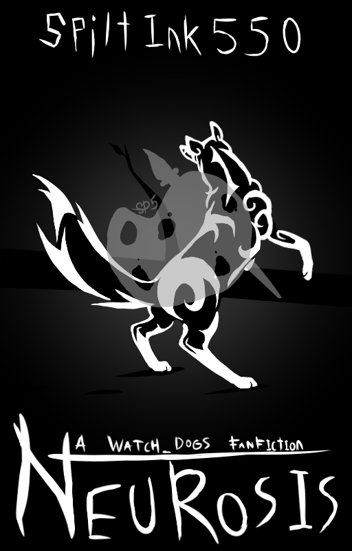
So I took the advice left on the "Official Book Cover" post (Especially with the watermark).
But I decided to go a more simplistic route because redrawing that other picture to look at least somewhat better would be a nightmare because the original took 3 days to finish.
The title of the FanFiction may change and the title will have much more meaning when the whole thing is released (Hopefully I'll get it out this year!).
And a message to my Watchers, I'm sorry for the lack of anything being posted, last week was insane because I got sick from eating too many gummy bears the night before, there was this big trip to Los Vegas, and I was helping with my two nephews that are still very little (2 and 3 years old to be exact).
Also, this is the first time for me drawing in the tribal style of artwork. I like it, but I don't think I'll make a bunch more artwork in this style, then again, who knows?
I began realizing that the fox doesn't actually look like a fox... bigger ears might help...
Drawn in MediBang with Huion 610PRO drawing tablet.
Image size
512x800px 110.14 KB
© 2017 - 2024 spiltink550
Comments8
Join the community to add your comment. Already a deviant? Log In
Simplicity as an art form is the attempt to reach the heart of a viewer with the fewest number of brush strokes, to accomplish the most with the least. I've heard it best said that simplicity done well is complexity done with the detail ironed out. With fewer decorations placed on a Christmas tree, one can pay more attention to each of the ornaments. In short, the quality of a piece is denoted by the technical proficiency, not the amount of detail, and this piece makes the most of its minimal detail with a good pose and body structure.
The most striking aspect of this piece's simplicity lies in its color scheme. With only two colors on the table, not much thought needs to be given to color theory beyond making sure to contrast what you want to be visible. Black and white make for the highest form of color contrast known to modern man, and they certainly work in this context to highlight the tribal markings while subtly also providing an outline for the creature on display. The use of sharp lines in the markings and tail provide contrast with the curves that form the creature's torso and legs, creating a well-rounded visual that demonstrably passes the silhouette test.
The pose is by-the-book beautiful. I can practically see the spine line and guidelines just from looking at the final product. The pose is dynamic, with the creature turned away and contorting its torso just so, it possesses a sense of depth thanks to the shadows underneath the frame and the minor use of foreshortening, and the line of action flows smoothly from one end to the other to clearly show the bend in the spine. Moreover, I find the balance of this character to be the most impressive aspect about the pose. The legs are bent in such a way that it feels believable they could support this animal even though it is clearly a quadruped, with the tail providing the additional weight and support structure for the back end to counterbalance the top-heavy front half.
As you mentioned in your description, the anatomy presented does not support the idea of this creature being a fox. In fact, with those ears and that neck, there's grounds for considering this beast part horse. The design shifts more toward cartoon than realism, so you have a little more leeway in your choice of playing with the anatomy, though at the very least it would be good for your growth as an artist to know how it really looks.
Given that this picture is cover art for a story, it's worth quickly analyzing this piece within that context as well. Traditionally, character-focused cover art follows a similar rule as public speaking: always face your audience. Generally, if the character is facing away or looking at something else, it's because there's something else on the cover worth looking at, and the creature looking away helps draw the viewer's eye toward it as the true object of focus. This picture does have that aspect to some effect with the young tree in the background. The watermark messes with the effect a little since it makes the tree harder to see, but without it, the only issue lies in the perspective. Given the creature's line of sight, it would appear that it is not looking directly at the tree, but rather above it and to the left. Perhaps there's something else off in the distance the creature is paranoid about, and that fear ties into the 'neurosis' that the title refers to. The stylized design still works very well for the cover art, and the black and white color scheme combined with the lack of life in the background presents a grim or desolate image. I admittedly can't quite tell what kind of story I'd be reading (aside from a Watch_Dogs one), but I could at least go in knowing it has nice cover art.
I think what I can say most about this picture is that you ended up making something good, but you may have missed your original target. The creature is not quite a fox, it's not quite looking at the tree, and it's not quite got a full drop shadow underneath it. If you can line up your crosshairs a little more, I'm sure next time you can render the full cast of Okami on a single canvas in glorious monochrome.
Make the most! (Smile)")
--

The most striking aspect of this piece's simplicity lies in its color scheme. With only two colors on the table, not much thought needs to be given to color theory beyond making sure to contrast what you want to be visible. Black and white make for the highest form of color contrast known to modern man, and they certainly work in this context to highlight the tribal markings while subtly also providing an outline for the creature on display. The use of sharp lines in the markings and tail provide contrast with the curves that form the creature's torso and legs, creating a well-rounded visual that demonstrably passes the silhouette test.
The pose is by-the-book beautiful. I can practically see the spine line and guidelines just from looking at the final product. The pose is dynamic, with the creature turned away and contorting its torso just so, it possesses a sense of depth thanks to the shadows underneath the frame and the minor use of foreshortening, and the line of action flows smoothly from one end to the other to clearly show the bend in the spine. Moreover, I find the balance of this character to be the most impressive aspect about the pose. The legs are bent in such a way that it feels believable they could support this animal even though it is clearly a quadruped, with the tail providing the additional weight and support structure for the back end to counterbalance the top-heavy front half.
As you mentioned in your description, the anatomy presented does not support the idea of this creature being a fox. In fact, with those ears and that neck, there's grounds for considering this beast part horse. The design shifts more toward cartoon than realism, so you have a little more leeway in your choice of playing with the anatomy, though at the very least it would be good for your growth as an artist to know how it really looks.
Given that this picture is cover art for a story, it's worth quickly analyzing this piece within that context as well. Traditionally, character-focused cover art follows a similar rule as public speaking: always face your audience. Generally, if the character is facing away or looking at something else, it's because there's something else on the cover worth looking at, and the creature looking away helps draw the viewer's eye toward it as the true object of focus. This picture does have that aspect to some effect with the young tree in the background. The watermark messes with the effect a little since it makes the tree harder to see, but without it, the only issue lies in the perspective. Given the creature's line of sight, it would appear that it is not looking directly at the tree, but rather above it and to the left. Perhaps there's something else off in the distance the creature is paranoid about, and that fear ties into the 'neurosis' that the title refers to. The stylized design still works very well for the cover art, and the black and white color scheme combined with the lack of life in the background presents a grim or desolate image. I admittedly can't quite tell what kind of story I'd be reading (aside from a Watch_Dogs one), but I could at least go in knowing it has nice cover art.
I think what I can say most about this picture is that you ended up making something good, but you may have missed your original target. The creature is not quite a fox, it's not quite looking at the tree, and it's not quite got a full drop shadow underneath it. If you can line up your crosshairs a little more, I'm sure next time you can render the full cast of Okami on a single canvas in glorious monochrome.
Make the most!
--